Staking Out The Competition
I mentioned in my previous post that the designs of some of the competition just aren’t aesthetically pleasing by any means. This is just the problem with the way they look. I could just design a better looking application, however that would be tackling a nuisance instead of a problem. I’ve found a number of issues that are actually worth deciphering. In this post i’ll take a closer look at some screenshots I captured earlier this week from my phone of the apps themselves in action.
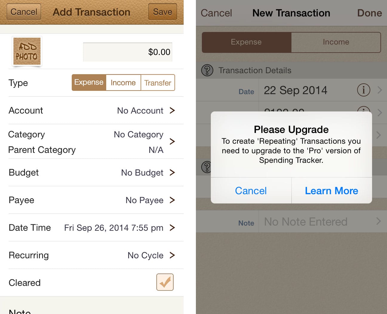
Free Budget

It also seems to advertise other services, as well as trying to get you to upgrade. This is a silly issue and on top of an extraordinarily bland interface i’m positive I can improve on Free Budget. It makes sense, though it’s very overwhelming. Budgeting needs to be simpler. That’s the idea of an app anyway, the trouble is, is “simple” is not the nature of budgeting. So the real problem I need to address with this interface is how do I simplify something so complex. The problem I am is tackling is taking the difficulty out of budgeting.
Money
“Money” is the name of the next app. Simple, basic and not too descriptive of the app. It seems slightly more intuitive, but again as soon as you click one option there’s an army of fields to fill in, nearly all of which are tiresome and confusing to trawl through. Not to mention aside from the home screen it’s just another white menu upon white menu. Comes in with some personality allowing you to customise each account with a photo. I’m all for creativity, but in my eyes this is just pointless in a budgeting app. Creativity and little features need to fit in, and it just doesn’t within a budgeting app. Add in the fact they want you to pay for base features? Doesn’t seem a smart move considering the other options around. On to the others…
Visual Budget
There are almost no words. Well, i’m sure I can consult a thesaurus. Messy, disorderly, loud, angry, turbulent, turmoil, aggressive, chaotic, cluttered. The list goes on. As long as I am completely opposite to visual budget, I think i’ll be alright.
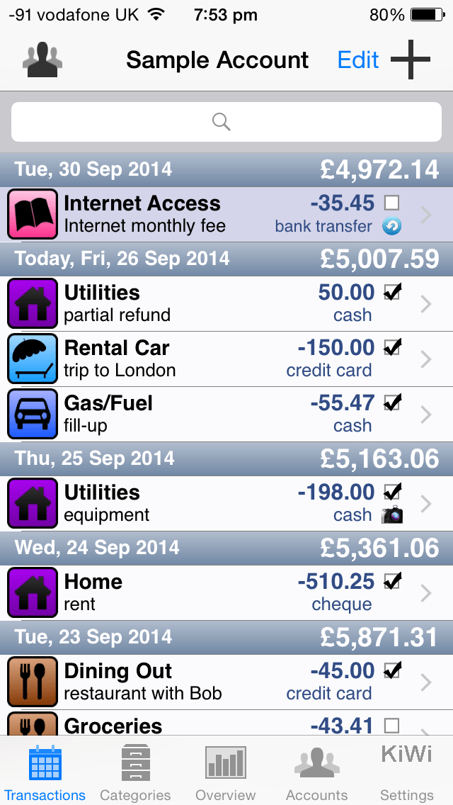
Spending
“Spending” is definitely the nicest to use and easiest to understand of all i’ve given a run with so far. If you turn your phone sideways you can even visualise your cash-flow, which is where i believe people have a lot of problems in comprehending their money. Though that’s it. Cash flow app. No advice and no use beyond that. Perhaps not being a one-trick-pony should be a priority?
You Need A Budget
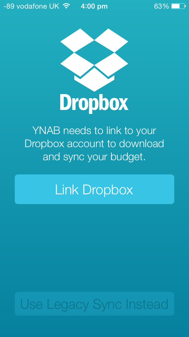
YNAB! If you have googled “budget” in the past, then no doubt you’ll have been directed to the all-star champion of personal finance, you need a budget. A powerhouse on the PC doing everything you need it to, YNAB has aced all reviews and offers the cutting edge in money management for your average joe. Every form of money management available from the basics to online lessons!
I downloaded the software the 34 day trial and it is safe to say that it does everything under the sun. However with every feature known to man in its belt, comes a rather steep learning curve. Not to mention a rather steep pricetag for a budgeting software. It even has cloud storage. Which is the trouble right now, trouble for me that is. You can’t use the app without logging into a dropbox account. At all. I find that to be rather annoying because the way I see it, if you’re not very good with money and you’re seeking in ways to correct this via a budgeting software, you may not have a dropbox account. It would be nice if it was optional. Whether it is a separate app or a necessary piece of tech to compliment the PC software, I can’t do much with YNAB right now. And I feel like it would be a little too much for someone just looking for a little assistance budgeting. Plus a price tag of 40 quid is a little miffing if you’re minding money.
Budgeting apps. For the most part they look terrible, so it’s clear to me this is a huge issue that I need to resolve. Not only this, I need to make the hall process easier to understand. Whether I tackle personal budgeting directly, or a facet of it remains to be seen. An area of budgeting seems like a good choice right now because there is a number of apps that try and teach how to be better at budgeting on whole, I’m thinking of an app that focuses on a niche. Perhaps insurance, managing monthly payments or travel. Travel. That’s a good one. I like travel. People like travel. People are bad with money. People are worse with money when they’re travelling. Interesting…